This Pro tutorial provides the steps to move WP Grid Builder‘s filters inside the Bricks‘ native Offcanvas on smaller viewport widths.
Let’s work with the Posts page as the view.
This means:
- a Page titled
Blogwas set as the Posts page at Settings → Reading. - This Page is being edited with Bricks and a Posts or Query Loop element with the query set to output Posts has been added.
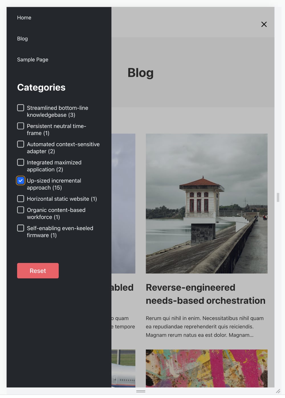
Step 1
Create these WP Grid Builder facets: Categories, Reset, Pagination.
Step 2
Set up your Posts page’s structure to look like this:

Step 3
Paste this in the Bricks editor at Settings (gear icon) → PAGE SETTINGS → CUSTOM CODE → Body (footer) scripts:
<script>
document.addEventListener("DOMContentLoaded", (event) => {
	// Create a media condition that targets viewports 991px and below
	const mediaQuery = window.matchMedia("(max-width: 991px)")

	function handleViewportChange(e) {
		// Check if the media query is true
		if (e.matches) {
			// Then move the filters inside the offcanvas
			document
				.querySelector(".brxe-nav-menu .bricks-mobile-menu-wrapper")
				.appendChild(document.getElementById("brxe-lfmfpu"))
		}
	}

	// Register event listener
	mediaQuery.addListener(handleViewportChange)

	// Initial check
	handleViewportChange(mediaQuery)
})
</script>
Replace brxe-lfmfpu with the ID of the Column that contains the Heading, Categories Facet and the Reset Facet i.e., the parent element/the left “sidebar” on desktops.
Step 4
Since these elements are being positioned inside the Offcanvas let’s make a few style changes so they look better.
Select the <= 991px breakpoint.
Select the left Column and set Padding all round to 30px. Set Width: 100%.
Select the right Column and set its Width: 100%.
Step 5
Edit your Header Template with Bricks.
Select your Nav Menu element and set Show mobile menu toggle: Tablet portrait.
Add this in its Custom CSS:
root .bricks-mobile-menu-wrapper ul.bricks-mobile-menu {
	overflow-y: visible;
}

root .bricks-mobile-menu-wrapper {
	overflow-y: auto;
	background-color: #23282d;
}
Reference
https://webdevetc.com/blog/matchmedia-events-for-window-resizes/