Updated on 4 Jul 2023
Tested in Bricks 1.8.2.
This Pro tutorial provides the steps to implement Mmenu Light for a sliding OffCanvas mobile menu in Bricks.
Step 1
If you haven’t already, create a menu at Appearance → Menus.

If you want an entire parent menu item (in the offcanvas) to be clickable, set its link to #.
Step 2
Copy Mmenu Light’s CSS to your Bricks’ install at Bricks → Settings → Custom code under Custom CSS.
Add the following at the end:
.close-icon {
    position: absolute;
    top: 12px;
    right: 12px;
    z-index: 1;
}
Copy Mmenu Light’s JS under Body (footer) scripts wrapped inside <script> and </script> tags.
Add the following before the </script> tag:
const menu = new MmenuLight(document.querySelector("#my-menu"), "(max-width: 767px)");

const navigator = menu.navigation();

const drawer = menu.offcanvas();

document.querySelector("#menu-trigger").addEventListener("click", (e) => {
		e.preventDefault();
		drawer.open();
});

// add a close icon in div.mm-ocd__content
document.querySelector(".mm-ocd__content").insertAdjacentHTML("afterbegin", `<button class="close-icon">
			<svg xmlns="http://www.w3.org/2000/svg" height="24px" viewBox="0 0 24 24" width="24px" fill="#666"><path d="M0 0h24v24H0V0z" fill="none"/><path d="M19 6.41L17.59 5 12 10.59 6.41 5 5 6.41 10.59 12 5 17.59 6.41 19 12 13.41 17.59 19 19 17.59 13.41 12 19 6.41z"/></svg>
		</button>`);

// when button.close-icon is clicked, close the menu
document.querySelector(".close-icon").addEventListener("click", (e) => {
		drawer.close();
});
We are
- initializing Mmenu Light on the parent of nav menu’s
<ul>at 767px breakpoint. - enabling Mmenu Light’s navigation and offcanvas add-ons.
navigation()creates the navigation with a fixed navbar and sliding submenus.offcanvas()creates an off-canvas drawer. - setting
#menu-triggerto open the offcanvas drawer on click. - injecting a close icon in the offcanvas.
- setting the offcanvas drawer to close when the close icon is clicked.
Step 3
Edit your Header template with Bricks.
When done, the structure might look like this:
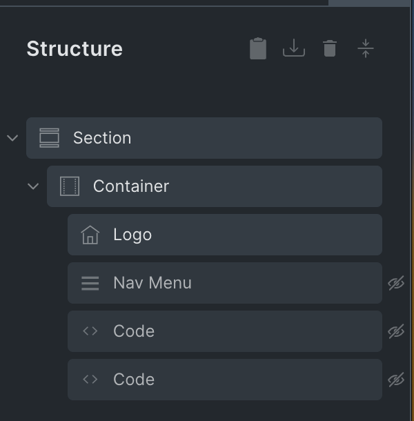
a) If you haven’t already, add a Nav Menu element.
Under the MOBILE MENU control group, Set “Show at breakpoint” to Never.
Switch to the Mobile landscape (<= 767px) breakpoint and set the Nav Menu’s display to none.
Switch back to the Desktop (Base breakpoint).
b) Add a Code element below the Nav Menu. This is for outputting the nav menu using WP native wp_nav_menu() function. The reason why do this vs just utilizing the already added Nav Menu element below the 768px breakpoint is because Bricks adds additional markup that creates issues for Mmenu to function properly.
<?php

wp_nav_menu( array(
	'menu' => 'Main Menu',
	'container_id' => 'my-menu'
) );

?>
Replace Main Menu with the name of your menu from Step 1.
Turn “Execute code” on.
Set Display to none.
We don’t need to set the Display to block at smaller breakpoint for this element.
c) Add another Code element having:
<a href="#my-menu" id="menu-trigger"><svg xmlns="http://www.w3.org/2000/svg" height="24px" viewBox="0 0 24 24" width="24px" fill="#ffffff"><path d="M0 0h24v24H0z" fill="none"/><path d="M3 18h18v-2H3v2zm0-5h18v-2H3v2zm0-7v2h18V6H3z"/></svg></a>This adds a hamburger icon which is the offcanvas trigger. The reason for not using an Icon element and setting its link is that the ID (menu-trigger) gets added to the element inside anchor tag and not to the anchor tag itself which is what we want for the ideal markup.
Turn “Execute code” on.
Set Width to auto.
Set Display to none.
Set Line height to 1.
Switch to <=767px breakpoint and set Display to block.
Step 4
Mmenu recommends that hash link menu items be wrapped in span tags instead of anchor tags.
Add the following in child theme‘s functions.php or a code snippets plugin:
add_filter( 'walker_nav_menu_start_el', 'my_walker_nav_menu_start_el', 10, 4 );
function my_walker_nav_menu_start_el( $item_output, $item, $depth, $args ) {
    if ( empty( $item->url ) || '#' === $item->url ) {
        $item_output = $args->before;
        $item_output .= '<span>';
        $item_output .= $args->link_before . apply_filters( 'the_title', $item->title, $item->ID ) . $args->link_after;
        $item_output .= '</span>';
        $item_output .= $args->after;
    }

    return $item_output;
}
How to set up on all widths (Desktop)
Set the Display of Nav Menu to None for Desktop (Base breakpoint). Should be the same for other breakpoints.
Undo the Display of the menu icon trigger Code element to none so it is the default (block).
In the JS code, change
const menu = new MmenuLight(
    document.querySelector("#my-menu"),
    "(max-width: 767px)"
);
to
const menu = new MmenuLight(
    document.querySelector("#my-menu")
);