Bricks’ native ‘Nav Menu’ element comes with a built-in mobile menu, which shrinks the menu down to a menu toggle button to open an offcanvas type container.
In this Pro tutorial, we’ll look at how we can combine multiple menus into this one mobile menu, so even though we may have multiple menus in different locations for desktop devices, for mobiles it’ll reduce to just one menu toggle button and all the menu items will be found inside of one mobile menu.
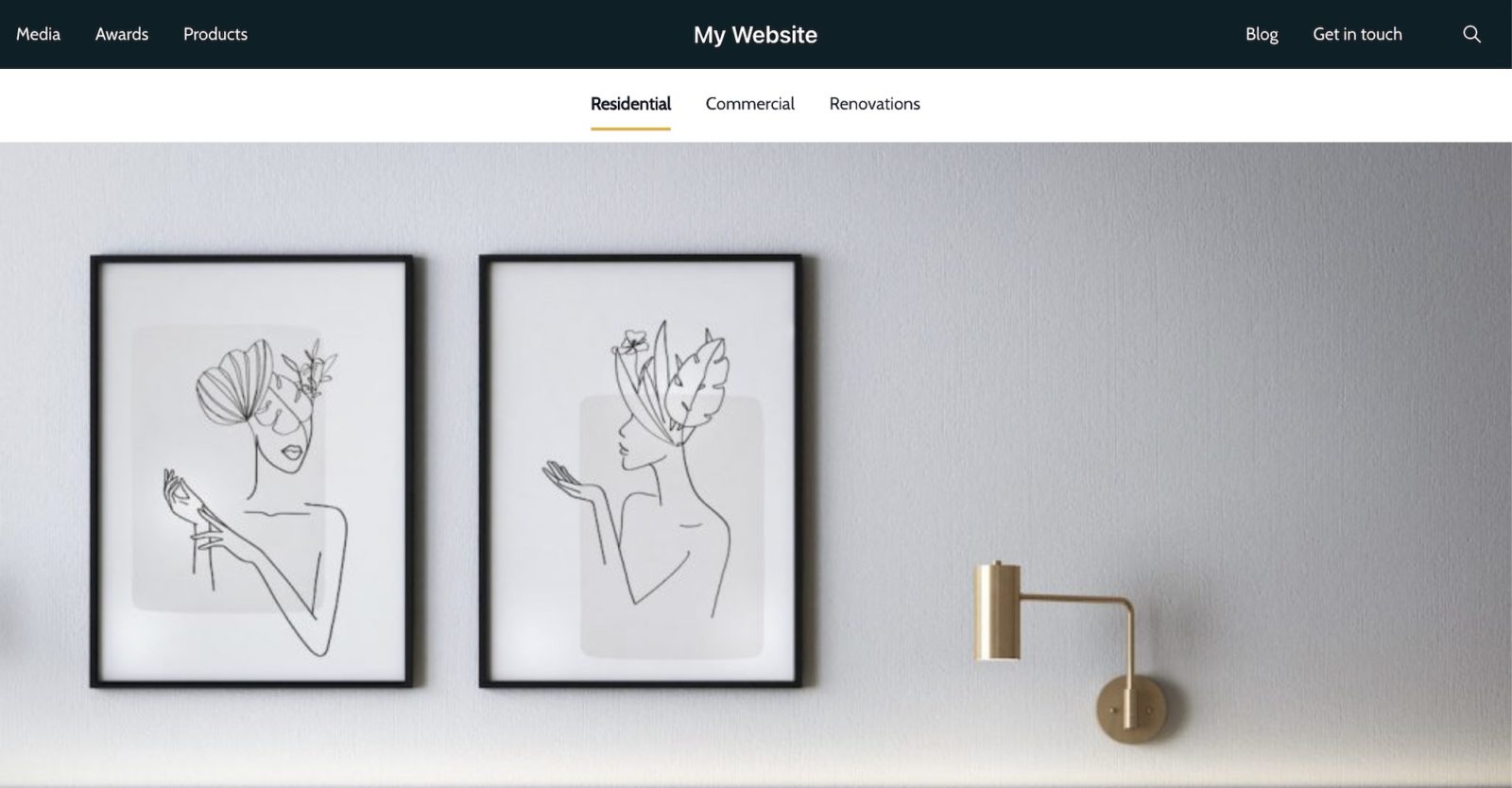
Example header with multiple, separate menus.. here we have three menus

For mobile, we want them all to be contained within one mobile menu and have only one menu toggle button to reveal them.

Choosing the Mobile Menu
The first step is to choose which of our menus is our ‘main menu’, which will be used for our one mobile menu. A sensible way to choose could be just based on where we want our menu toggle button to be placed. If we have multiple header rows, it’ll be the menu that is positioned inside of the header row where we want our menu toggle to appear on mobile.
Then we note the element’s ID for use later, it’ll look something like ‘brxe-jlvunl’ (written in the class dropdown).
Lastly, we choose the width where the mobile menu needs to kick in, for eg choosing ‘Mobile landscape’ from the ‘Show Mobile Menu Toggle’ dropdown will ensure the mobile menu toggle is visible at 478px and below.
Choosing the ‘Other Menus’
Not every menu on the page may need to be included in our mobile menu. For example, some menus inside of the footer may need their own menu toggle, or maybe have no separate mobile version at all.
The way to select which menus are included is to give them a class. Any menus where the menu items need to be included inside of our mobile menu, we’ll give them a class ‘move-menu’. We also need to set the width for where the mobile menu kicks in, to match our main menu. For example, select ‘Mobile landscape’ again. (important – this needs to be the same as the main menu to make sure the menu items are all hidden at the same width)
Combining into One Mobile Menu
To combine the menus, we need to move the menu items from all of the other menus into our main menu. We can do this with javascript using a code element, added anywhere inside of our header template.
Here’s the javascript to add, the only thing that needs changing is the first variable ‘mainMenuID’, where the ID needs to match that of our main Nav menu element. (don’t include the hash in the ID, just the ID itself. eg brxe-jlvunl.
(as we’re adding inside of the code element, wrap the javascript inside of a <script> </script> and make sure to enable ‘Execute Code’)
window.addEventListener("DOMContentLoaded", function() {

    const mainMenuID = 'brxe-jlvunl'; /* change this to match the ID of your main menu */

    document.querySelectorAll('.move-menu').forEach((otherMenu) => {

        otherMenu.querySelector('.bricks-mobile-menu-toggle').style.display = "none"

        otherMenu.querySelectorAll('.bricks-mobile-menu > .menu-item').forEach((otherMenuItem) => {
            otherMenuItem.classList.add(otherMenu.id + '-menu-item')
        })

        otherMenu.querySelectorAll('.' + otherMenu.id + '-menu-item').forEach((combineItem) => {
            document.getElementById(mainMenuID).querySelector('.bricks-mobile-menu').append(combineItem)
        })

    })

});
That’s it
Now only one menu toggle button will appear and all of the menu items from the other menus will be included inside the one mobile menu.

Any styling/customization for the mobile menu now only needs to be done on that one main menu, all the new menu items inside will just inherit this styling automatically.