In this Pro tutorial we’ll use GSAP’s ScrollTrigger library in Bricks to create a section that will scroll horizontally across a number of full width containers as the user scrolls down the page. This can be used on multiple sections on a page.
For the tutorial, we’ll use Bricks’ Query Loop feature to fetch a few posts with the container element and have these as the content that is inside the horizontal scrolling section. The effect is turned off for <992px (tablet portraight), where the posts are then stacked instead, this can be easily changed.
Page Export
An export file of the demo page is provided at the end.
Creating the Structure in Bricks
The demo page has a fairly simple structure, consisting of just three main sections. The top and bottom sections are just regular sections (container element) to show where other content would be on the page and can be ignored. The second section is where all of the horizontal scrolling is implemented. This is our horizontal scroll container, which we’ll give the class ‘horizontal-scroll-container’ so we can apply some CSS later.
If we were creating two horizontal scrolling sections on the same page, we’d just create the same structure for that section and give it the same ‘horizontal-scroll-container’ class.
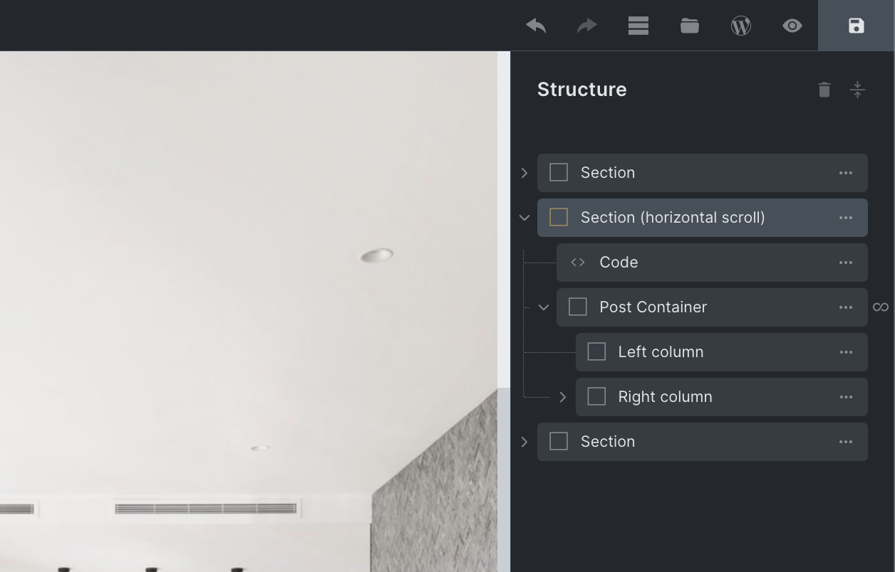
We can see from the structure, there’s only one container inside of the horizontal scroll section, our ‘post container’. This is being duplicated by the Query Loop feature to output three posts. If we weren’t using the Query loop, we’d just add more containers manually inside of the section and add in the content.
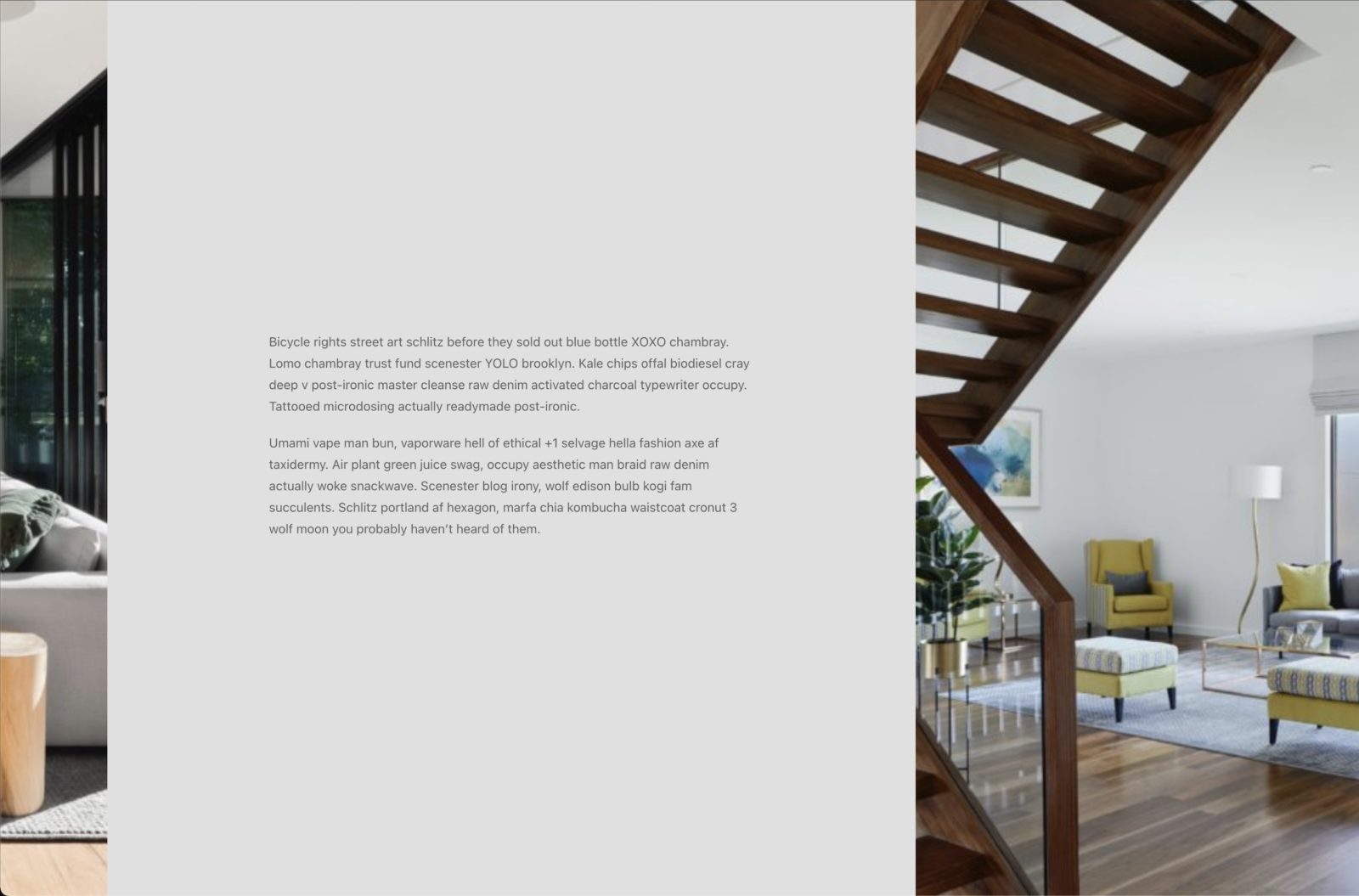
Each of the post containers takes up the full width of the viewport and contains two columns, with the featured image background on the left and some post content added in on the right.

Obviously the design/layout of the content inside of the containers is up to you, but I recommend having these ‘post containers’ themselves take up the entire viewport. So this means giving them a width of 100% and a height of 100vh and keeping all of the content visible within the viewport.
To copy the demo page layout exactly, we also need to give the left column (the column with the background set as the featured image) the class ‘horizontal-scroll-image’.
Adding CSS to set the Layout
We need to do a few things that are can be added with CSS (to override some Bricks styling)
Here we are..
- Making sure the post containers are aligned horizontally with flex-direction: row on the section.
- Making sure each post container is full viewport width and full viewport height.
- Making sure the section is scrollable inside of the builder (so the offscreen content is editable)
- Setting the featured image column to be 50% (optional, only if using columns).
  .horizontal-scroll-container {
    display:flex;
    flex-wrap:nowrap;
    flex-direction:row;
    will-change: transform;
    width: unset;
  }

  .horizontal-scroll-container > .brxe-container {
    width: 100vw;
    flex-shrink: 0;
    height:100vh;
  }

   .brx-body.iframe .horizontal-scroll-container {
     overflow-x: scroll;
  }

.horizontal-scroll-container .horizontal-scroll-image {
   flex-basis: 50%;
   flex-shrink: 0;
}
Mobile Styles
In order to stack the post containers vertically for mobile, we can add the following CSS..
@media only screen and (max-width: 991px) {

  .horizontal-scroll-container {
     flex-direction: column;
  }

  .horizontal-scroll-container > .brxe-container {
     height: auto;
  }

  .horizontal-scroll-container .horizontal-scroll-image {
    height: 40vh;
    flex-basis: auto;
  }

}
(It’s important to change the height back to auto, as the content could be taller than the viewport on mobile. Also to set a height for the featured image, if you’re going with the same column layout, because an empty div by itself won’t have a height so we need to set it to make the background visible. This is set to 40vh on the demo page.)
Creating the Horizontal Scroll Effect
Now we have the overall layout set up, but at the moment all we have is a section that falls off the viewport to the right (because it currently has a total width of 300vw due to the three large containers), so we have to scroll to the right to see the extra content. To actually create the effect where vertical scrolling is paused and the content automatically scrolls horizontally, this is where we need to apply the ScrollTrigger library.
To add the scrollTrigger library, we need the following two JS files..
https://cdnjs.cloudflare.com/ajax/libs/gsap/3.10.4/gsap.min.js
https://cdnjs.cloudflare.com/ajax/libs/gsap/3.10.4/ScrollTrigger.min.js
We can copy these into our Bricks child theme by adding a ‘js’ directly and enqueuing from the functions.php file, inside of the ‘wp_enqueue_scripts’ function like so..
wp_enqueue_script( 'gsap', get_stylesheet_directory_uri() . '/js/gsap.min.js', '', '3.10.4', true );
wp_enqueue_script( 'scrollTrigger', get_stylesheet_directory_uri() . '/js/scrollTrigger.min.js', '', '3.10.4', true );
Now we can add our own JS to initialise the scrollTrigger and apply it to our sections with the class ‘horizontal-scroll-container’. We can add this to a code to a code element inside of Bricks, making sure to enable ‘execute code’.
<script>
document.addEventListener("DOMContentLoaded", function(e) {

    gsap.registerPlugin(ScrollTrigger)

    let scrollContainers = document.querySelectorAll('.horizontal-scroll-container');

    ScrollTrigger.matchMedia({

        // desktop only
        "(min-width: 992px)": function() {

            scrollContainers.forEach((scrollContainer) => {

                gsap.to(scrollContainer, {
                    x: () => -(scrollContainer.scrollWidth - document.body.clientWidth) + "px",

                    scrollTrigger: {
                        start: "center center",
                        trigger: scrollContainer,
                        invalidateOnRefresh: true,
                        pin: true,
                        scrub: true,
                        anticipatePin: 1,
                        pinSpacing: true
                    }
                })

            });

        }

    })

});
</script>
Notice that we’re making sure this is only being applied for 992px and over, which matches the CSS we added earlier, when adding our mobile styles. Changing the breakpoint where the effect kicks in needs to be changed in both the JS and CSS.
ScrollTrigger Options
A brief explanation on what we’re telling scrollTrigger to do in the JS here, using some of the built-in available options and what they’re doing;
- Only if we’re on desktop (min-width 992px)
- .. then find all of the horizontal scroll sections.
- .. for each one, set up an animation that will move the content along the x axis (using transforms)
- .. start the animation only when the center of the section reaches the center of the viewport.
- .. finish the animation only after the content has moved by exactly the entire width of the section, minus the viewport width
- .. making sure to ‘pin’ the section to the viewport throughout the animation (to create the paused scroll effect)
- .. making sure to ‘scrub’ through animation to make sure it’s controlled directly by the user scrolling vertically.
That’s it.
This is a fairly simple implementation of ScrollTrigger, but can be quite useful when done well.
Hopefully, it gives you some insight into how to go about using it inside Bricks, and an idea of how some of the options were used together to create the finished effect.
Template Export
Here’s a link to the template JSON export (right-click and download the JSON file). You can then upload to your site using the template import feature in Bricks.
You’ll find all of the JS from above inside of a code element (enable ‘execute the code’) and some of the CSS in the horizontal scrolling section element’s custom CSS. The rest is built using the UI styling settings.
(Note that in the template export the GSAP and ScrollTrigger scripts are also inside the code element. This can be removed after you’ve copied and enqueued the JS files into a child theme)