There are at least three ways in which we can build custom loops in Bricks.
- Posts element
- Turning on Query Loop on a container
- Code element
While #2 and #3 give the ultimate flexibility w.r.t the generated HTML output, #1 is pretty handy as well.
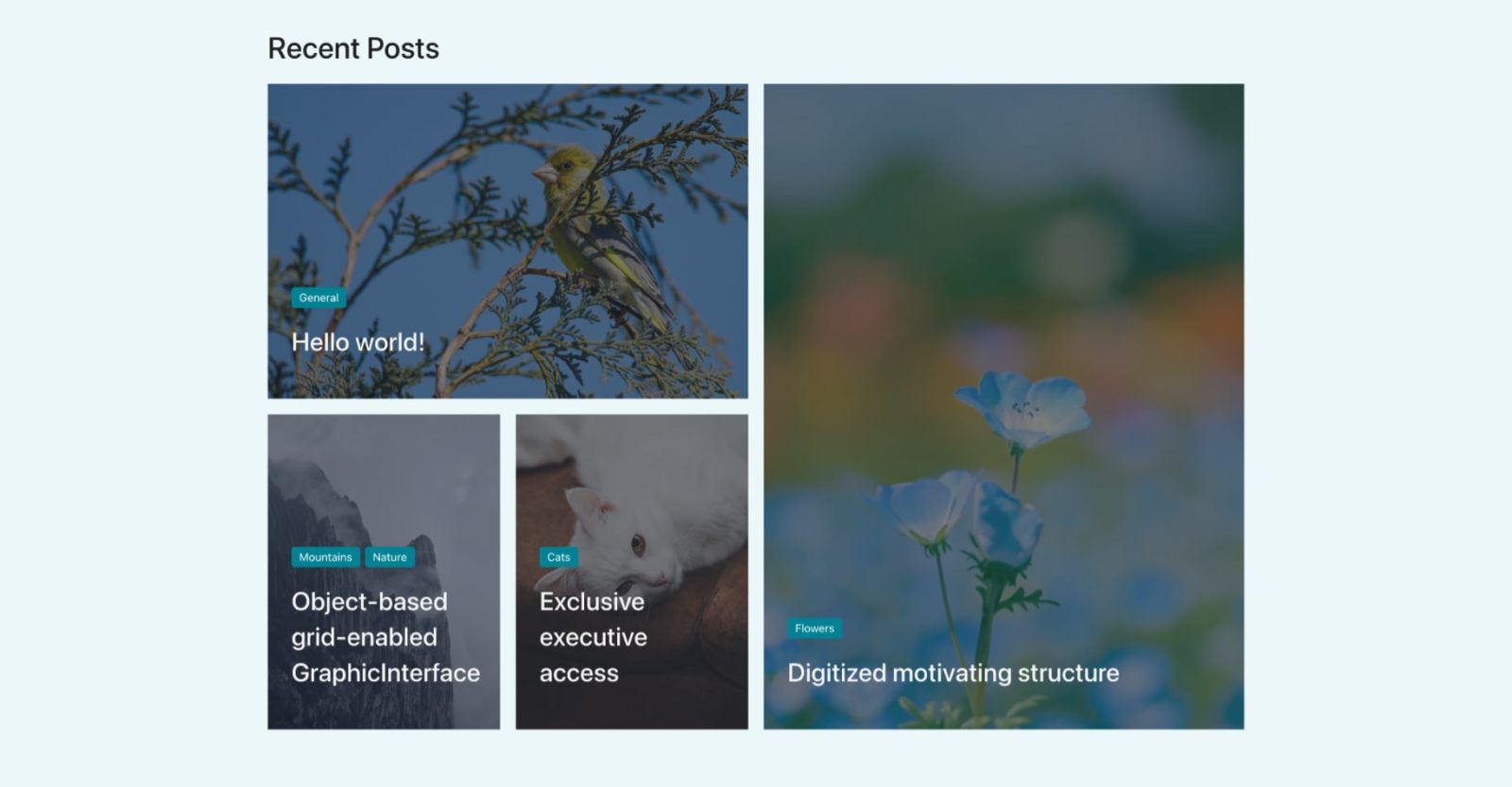
This Pro tutorial provides the steps to customize the Posts element’s output using CSS Grid to have the 4 latest posts such that the latest is at the top left, the next one spanning two rows, and the next two at the bottom left.

In the Table Portrait (991px and below), we shall make the posts appear in a 2 x 2 grid and as a single column stacked below each other in Mobile Landscape (767px and below).
Step 1
Add a Posts element inside a container.

Query: 4 Posts Per Page.

Let us show the post’s categories and title overlayed on top of the featured image for each post.
There is no built-in dynamic field in Bricks currently to have the categories as separate links that I know of so we can style them to look like this:

So let’s define a custom function that returns the linked terms for the specified taxonomy having the specified class (categories in the example below) like this:
<div class="categories">
	<a href="https://bricks.local/category/cats/mountains/" rel="tag">
		Mountains
	</a>
	<a href="https://bricks.local/category/nature/" rel="tag">
		Nature
	</a>
</div>
Add the following in your child theme’s functions.php or a code snippets plugin like WPCodeBox:
function wpdd_get_linked_tax_term_links( $tax, $class = 'terms' ) {
    return get_the_term_list( get_the_ID(), $tax, "<div class=$class>", '', '</div>' );
}
Note:
<?php needs to be present at the top if the code is being added in a code snippets plugin.
We are setting a default class of terms if the second argument is not passed when calling our custom function.
Back in the Bricks editor, add this Dynamic Data field:
Wrapping function arguments in quotes is optional in Bricks. If you want to, ensure that they are single quotes and not double quotes.
So the above is the same as:

In the Typography area, you may want to set white color and a font size like 14px.
Toggle Overlay on.
Next, add a
field.
HTML tag: H3
Margin: 20px on top and bottom
Text color under Typography: #ffffff
Toggle Overlay on.
Configure Overlay control group like this:

For the Background Color, set it to a dark color with some transparency.

Add a class of say, posts-grid to the Posts element.
Step 2
Add the following in STYLE → CSS area for the Posts element whilst ensuring that posts-grid class is selected:
.categories a {
	background-color: #008294;
	padding: 6px 10px;
	border-radius: 4px;
	display: inline-block;
	line-height: 1;
}

.categories a:not(:first-child) {
	margin-left: 6px;
}

.categories a:hover {
	background-color: #0098ae;
}

root {
	overflow: visible;
}

root .bricks-layout-wrapper {
	display: grid;
	gap: 20px;
	grid-template-areas:
	    "top top right right"
	    "bottom-left bottom-right right right";
	margin-right: 0 !important;
	margin-bottom: 0 !important;
}

root .bricks-layout-item {
	width: auto;
	padding-right: 0 !important; /* removes the horizontal gap between items */
	padding-bottom: 0 !important; /* removes the vertical gap between items */
}

root .bricks-layout-item:first-child {
	grid-area: top;
}

root .bricks-layout-item:nth-child(2) {
	grid-area: right;
}

root .bricks-layout-item:nth-child(3) {
	grid-area: bottom-left;
}

root .bricks-layout-item:nth-child(4) {
	grid-area: bottom-right;
}

root .bricks-layout-item:nth-child(2) .bricks-layout-inner,
root .bricks-layout-item:nth-child(2) .bricks-layout-inner .image-wrapper {
	height: 100%;
}

/* Uncomment the block below to control the height of each item. Default is 400px */
/* root .bricks-layout-wrapper[data-layout=grid] .image-wrapper {
	padding-top: 300px;
} */

/*@media (max-width: 991px) {
	root .bricks-layout-wrapper {
		display: flex;
		flex-direction: column;
		flex-wrap: wrap;
	}
}*/

@media (max-width: 991px) {
	root .bricks-layout-wrapper {
		grid-template-columns: repeat(2, 1fr);
		grid-template-rows: repeat(2, 1fr);
		grid-template-areas: none;
	}

	root .bricks-layout-item:first-child {
		grid-area: auto;
	}

	root .bricks-layout-item:nth-child(2) {
		grid-area: auto;
	}

	root .bricks-layout-item:nth-child(3) {
		grid-area: auto;
	}

	root .bricks-layout-item:nth-child(4) {
		grid-area: auto;
	}
}

@media (max-width: 767px) {
	root .bricks-layout-wrapper {
		grid-template-columns: 1fr;
		grid-template-rows: 1fr;
		grid-template-areas: none;
	}
}
That’s it!