The “Posts” element in Bricks has “Grid” as the default layout but the actual CSS it applies on the page feels hacky with negative margins and padding values to compensate for those adjustment etc.
This Pro tutorial provides the CSS code for
- automatic responsive grids and
- manual responsive grids
using CSS Grid for the Posts element.
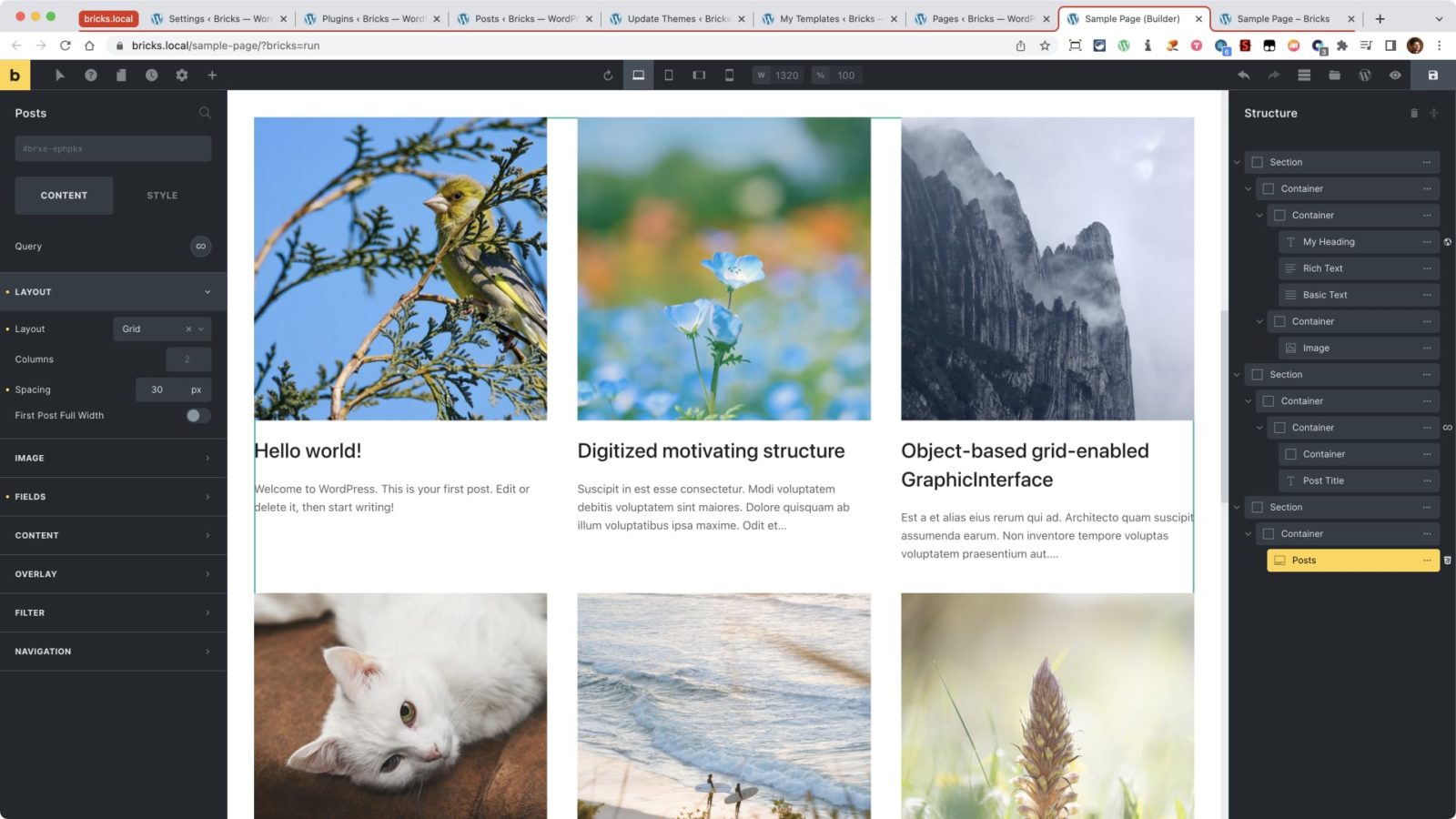
Add a Section having a Container.
Add a Posts element inside the Container.
Under the CONTENT tab, ensure that the Layout is Grid. This is the default setting. The default spacing value of 30px can be left alone as well. It is going to be overridden with our custom CSS.
Go to STYLE → CSS and under Custom CSS paste:
root > ul.bricks-layout-wrapper {
	margin-right: 0;
	margin-bottom: 0;
	display: grid;
	grid-template-columns: repeat(auto-fit, minmax(300px, 1fr));
	grid-column-gap: 40px;
	grid-row-gap: 60px;
}

root .bricks-layout-item {
	width: auto;
	padding-right: 0;
	padding-bottom: 0;
}
With that, posts should appear in 3 columns on the desktop and automatically become 2 and 1 as the viewport size reduces. Check on the front end.
If you wish to have manual control and specify exactly how many posts should appear at what breakpoint, add this CSS instead and modify to suit:
root > ul.bricks-layout-wrapper {
	margin-right: 0;
	margin-bottom: 0;
	display: grid;
	grid-template-columns: repeat(3, 1fr);
	grid-column-gap: 40px;
	grid-row-gap: 40px;
}

root .bricks-layout-item {
	width: auto;
	padding-right: 0;
	padding-bottom: 0;
}

@media (max-width: 767px) {
	root > ul.bricks-layout-wrapper {
		grid-template-columns: 1fr 1fr;
	}
}

@media (max-width: 479px) {
	root > ul.bricks-layout-wrapper {
		grid-template-columns: 1fr;
	}
}