Updated on 19 June 2024
This article is a compilation of some possible editor tweaks that make working with the Bricks builder better. “Better” is of course subjective and not all these are useful to everyone.
Custom CSS for the editor interface can be entered in Bricks → Settings → Builder → Builder Mode: Custom → Save Settings → Builder Mode (Custom) text area.
The following were tested in Bricks 1.5 with the dark (default) editor theme.
Table of Contents
- Make highlight of the active element in the structure more prominent
- Sticky structure panel header
- Make “View on frontend” button always appear
- Make + button more prominent
- Make active STYLE panel more prominent
- Make controls separators more prominent
- Make active class prominent
- Move element actions under the element
- Larger input area for Margin and Padding inputs
- Move the structure panel to the left side
- Make the “Has Setting” indicator more prominent
- Increase the opacity of element states svgs in the Structure panel
- Reorder pinned elements
- Increase font-size of control labels for readability
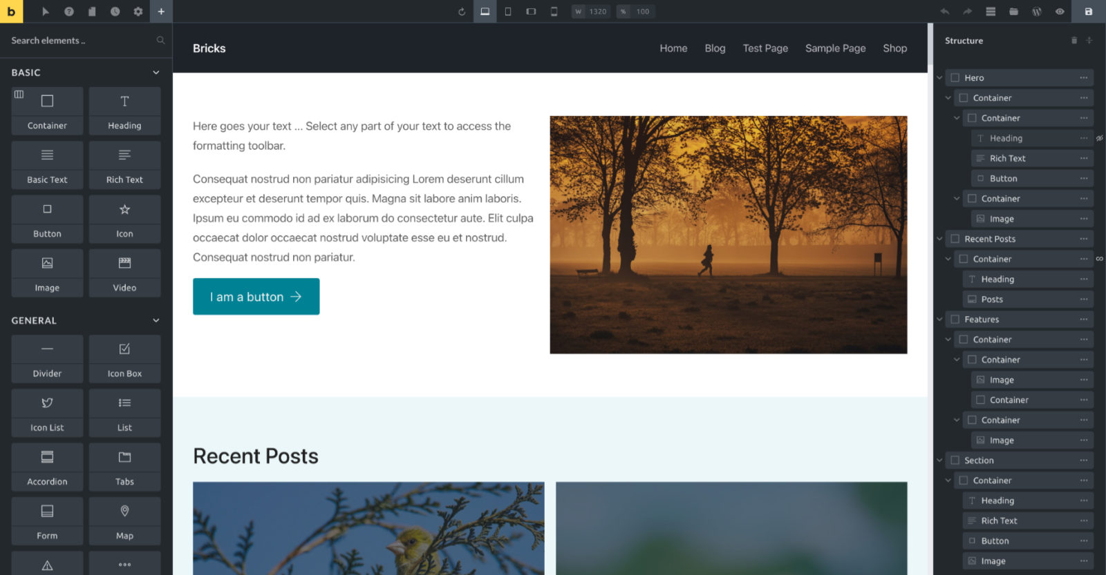
Make highlight of the active element in the structure more prominent
Before

After

CSS:
/* --- Make highlight of the active element in structure more prominent --- */
#bricks-structure .element.active>.structure-item {
    background-color: var(--builder-color-accent);
}

#bricks-structure .element.active>.structure-item input,
#bricks-structure .element.active>.structure-item>.title input,
#bricks-structure .element.active>.structure-item>.title i,
#bricks-structure .element.active .structure-item .more {
    color: #000;
}

#bricks-structure .element.active>.structure-item input::-moz-selection { /* Code for Firefox */
  color: #fff;
  background: #1a99e0;
}

#bricks-structure .element.active>.structure-item input::selection {
  color: #fff;
  background: #1a99e0;
}

#bricks-structure .element.active > .structure-item:hover .actions .action .bricks-svg-wrapper path {
	color: #111;
}
Sticky structure panel header
#bricks-structure #bricks-panel-header {
	position: sticky;
	top: 0;
	background-color: var(--builder-bg);
}
Make “View on frontend” button always appear
At the moment accessing the “View on frontend” needs a click on “Preview mode” button first.
We can reduce this by adding:
/* --- Make "View on frontend" button always appear */

#bricks-toolbar li.new-tab {
	display: flex !important;
}
Credit for idea: Yan Kiara.
Make + button more prominent
Before:

After:

/* --- Make + button more prominent */

#bricks-toolbar .logo {
	background-color: #818689;
}
#bricks-toolbar .logo:hover {
	background-color: var(--builder-color-accent);
}

#bricks-toolbar li.elements {
	background-color: var(--builder-color-accent);
	opacity: 1;
}
#bricks-toolbar li.elements:hover {
	background-color: #edca5b;
}

#bricks-toolbar li.elements .bricks-svg-wrapper .bricks-svg {
	color: var(--builder-border-color);
}
Credit for idea:
Make active STYLE panel more prominent
Before

After

/* --- Make active STYLE panel more prominent */

.bricks-panel-controls .control-group.open .control-group-title {
	background-color: var(--builder-color-accent);
	color: #000;
	font-weight: 600;
	letter-spacing: 2px;
}

.control-group.open {
	background-color: #161614;
}
Credit: James Lively
Make controls separators more prominent
Before

After

/* --- Make controls separators more prominent */

.bricks-panel-controls .control-groups .control-separator {
	background-color: var(--builder-bg-accent);
	margin: 0;
	padding: 10px 20px;
}

.bricks-panel-controls .control-separator label {
	letter-spacing: 2px;
	font-weight: 500;
	font-size: 11px;
	padding: 0;
}

.bricks-panel-controls .control-separator .control-inner {
	gap: 0;
}

.bricks-panel-controls .control {
	margin-bottom: 8px;
}

[data-control=separator]:before {
	display: none;
}
Make active class prominent
Before

After

/* --- Make active class prominent */

#bricks-panel-element-classes .active-class.active input {
	background-color: var(--wp--preset--color--light-green-cyan);
	color: #000;
}
Move element actions under the element
Not needed for 1.5 beta and above.
Before

After

Add the following at Bricks → Settings → Custom code:
/* --- Move element actions under the element --- */

.brx-body.iframe .bricks-element-actions {
	top: 100%;
}Larger input area for Margin and Padding inputs
Before

After

div[data-controlKey="_margin"] ul.dimensions,
div[data-controlKey="_padding"] ul.dimensions {
	display: grid;
	grid-template-columns: 1fr 1fr;
	gap: 10px;
}
Credit: Keviin Cosmos.
Move the structure panel to the left side

#bricks-preview.show-structure {
	margin-right: unset;
	margin-left: 300px;
}

#bricks-structure {
	right: unset;
	left: 300px;
}

#bricks-panel {
	z-index: 1000;
}
Credit: Keviin Cosmos.
Make the “Has Setting” indicator more prominent
Before

After

CSS:
/* --- Prominent Has Setting Indicators --- */
.bricks-panel-controls .has-setting {
	left: -11px;
	width: 3px;
	background-color: var(--builder-color-accent);
	transition: background-color 0.1s;
	transform: none;
}
.bricks-panel-controls .control-group-title .has-setting {
	left: 9px;
}
.bricks-panel-controls .has-setting:hover {
	background-color: transparent;
}
.bricks-panel-controls .has-setting .indicator {
	display: none;
}
Credit: Doug Rider.
Increase the opacity of element states svgs in the Structure panel
Before

After

/* --- Turn off 0.5 opacity of element states svgs --- */
#bricks-structure .structure-item .element-states svg {
	opacity: 1;
}
Reorder pinned elements
If you would like to reorder pinned elements, here’s some sample CSS you could use.

/* --- Reorder pinned elements */

.bricks-add-element[data-element-name="section"] {
	order: 1;
}

.bricks-add-element[data-element-name="container"] {
	order: 2;
}

.bricks-add-element[data-element-name="div"] {
	order: 3;
}

.bricks-add-element[data-element-name="heading"] {
	order: 4;
}

.bricks-add-element[data-element-name="text-basic"] {
	order: 5;
}

.bricks-add-element[data-element-name="code"] {
	order: 6;
}

.bricks-add-element[data-element-name="image"] {
	order: 7;
}

.bricks-add-element[data-element-name="post-title"] {
	order: 8;
}

.bricks-add-element[data-element-name="button"] {
	order: 9;
}

.bricks-add-element[data-element-name="template"] {
	order: 10;
}

.bricks-add-element[data-element-name="shortcode"] {
	order: 11;
}

.bricks-add-element[data-element-name="posts"] {
	order: 12;
}
Increase font-size of control labels for readability
I find the default font size of controls a tad tiny and the contrast in some areas not so great due to low opacity of certain elements.
The following CSS improves the readability a bit.
/* --- Improve readability --- */
[data-builder-mode=custom] {
    --builder-placeholder-opacity: .75;
    --builder-color-description: #ddd;
}
#bricks-panel-elements-categories .category-title {
    font-size: 16px;
    letter-spacing: 1px;
}
#bricks-panel-search {
    font-size: 16px !important;
}
.bricks-add-element .element-label,
.bricks-structure-list input[type="text"],
#panel-element-classes .bricks-control-popup ul li .name,
.bricks-panel,
.bricks-panel-controls .control-group-title,
.bricks-panel-controls .control .description {
    font-size: 15px;
}
#panel-element-classes .active-class input,
#panel-element-classes .active-class .symbol,
[data-balloon]:after {
    font-size: 14px;
}
[data-control=editor] .wp-editor-tools button {
    font-size: 13px;
}
Before

After
